I am a graphic designer, motion designer, video producer, editor, podcaster, educator, photographer, and cyclist living in NYC. I like making things that excite people and help make things easier to understand.
This site highlights some of the graphics work that I’ve done in the last few years.
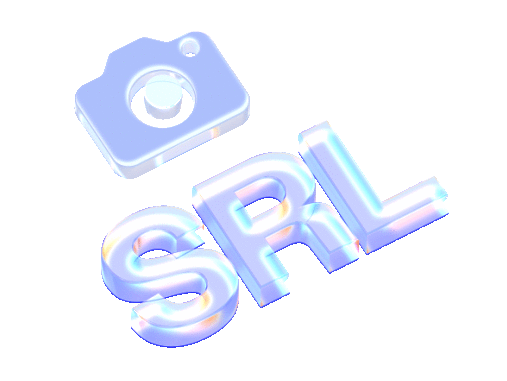
PBS NEWS STUDENT REPORTING LABS
At PBS News Student Reporting Labs, I made conceptualized and made intro animations, posters, logos, lower thirds, social media posts, stickers, invitations, t shirts, business cards, gifs, standees, reports, books and everything else a national broadcaster and journalism training organization would need.
One of my favorite projects at SRL is a series called Moments of Truth. It’s about encountering problems with our digital world, like disinformation or addiction and how people move past them.
These clips shows a sequence where I animated the experience of a teen who became obsessed with his friend and checking notifications on his phone.
I developed and designed the look of the show by running design sessions with the producers, and consulting the subjects. I learned how to run these from my colleagues at PBS News
These are clips from an episode about a man who became obsessed with online conspiracies and sufferred from drug induced psychosis.
All the interviews and most of the filming here and at SRL in general were done by high school students. The SRL producers and I handled post production after the rough cut.
These clips explain how anonymous social app Yik Yak enabled bullying on college campuses and its eventual takeover by Sidechat
Example of social media posts for SRL Events.
Instructional guide for students.
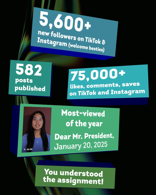
Example of year-in-review post
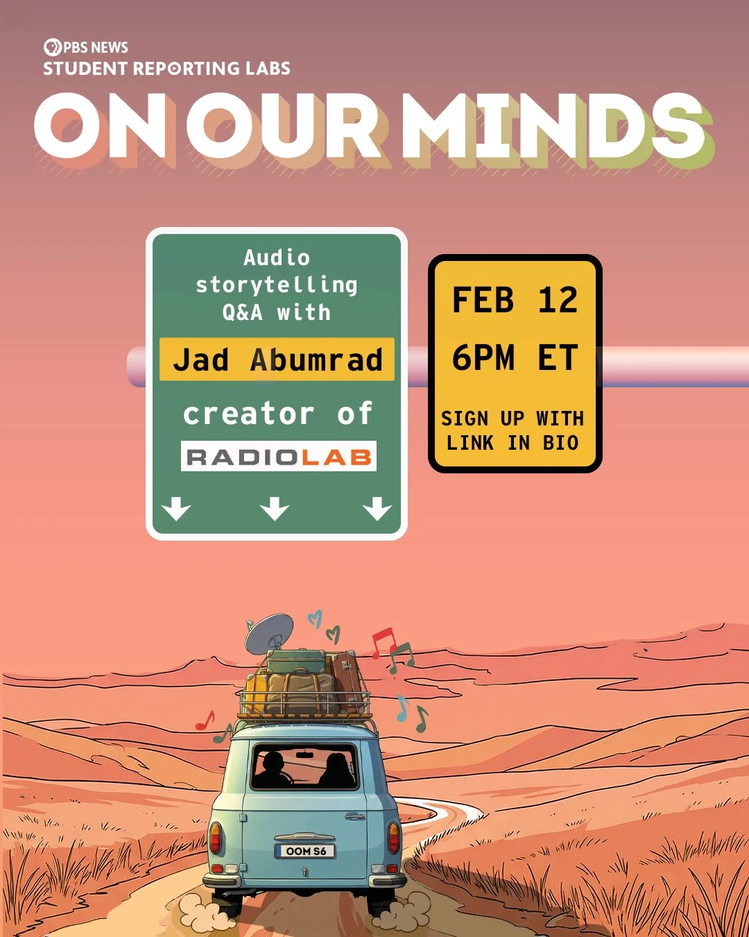
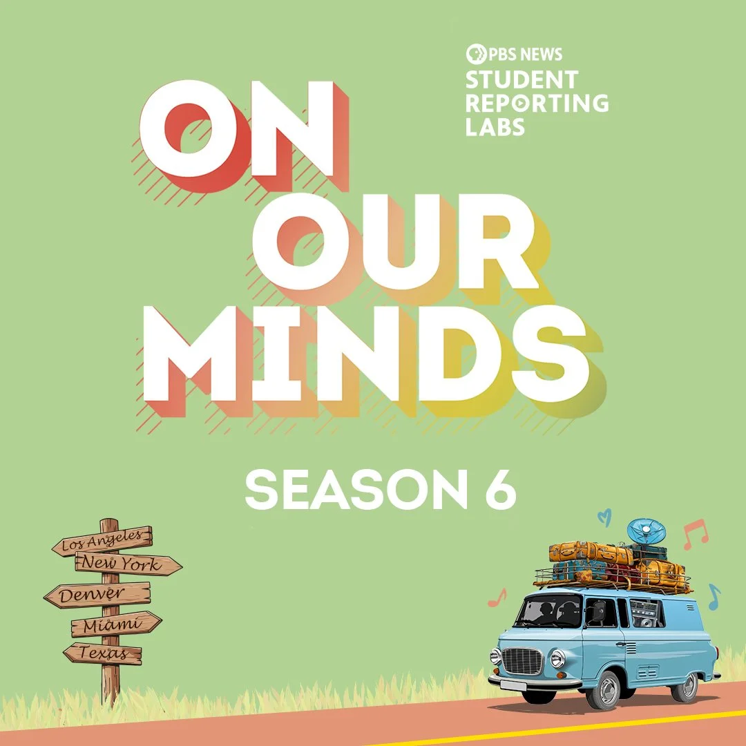
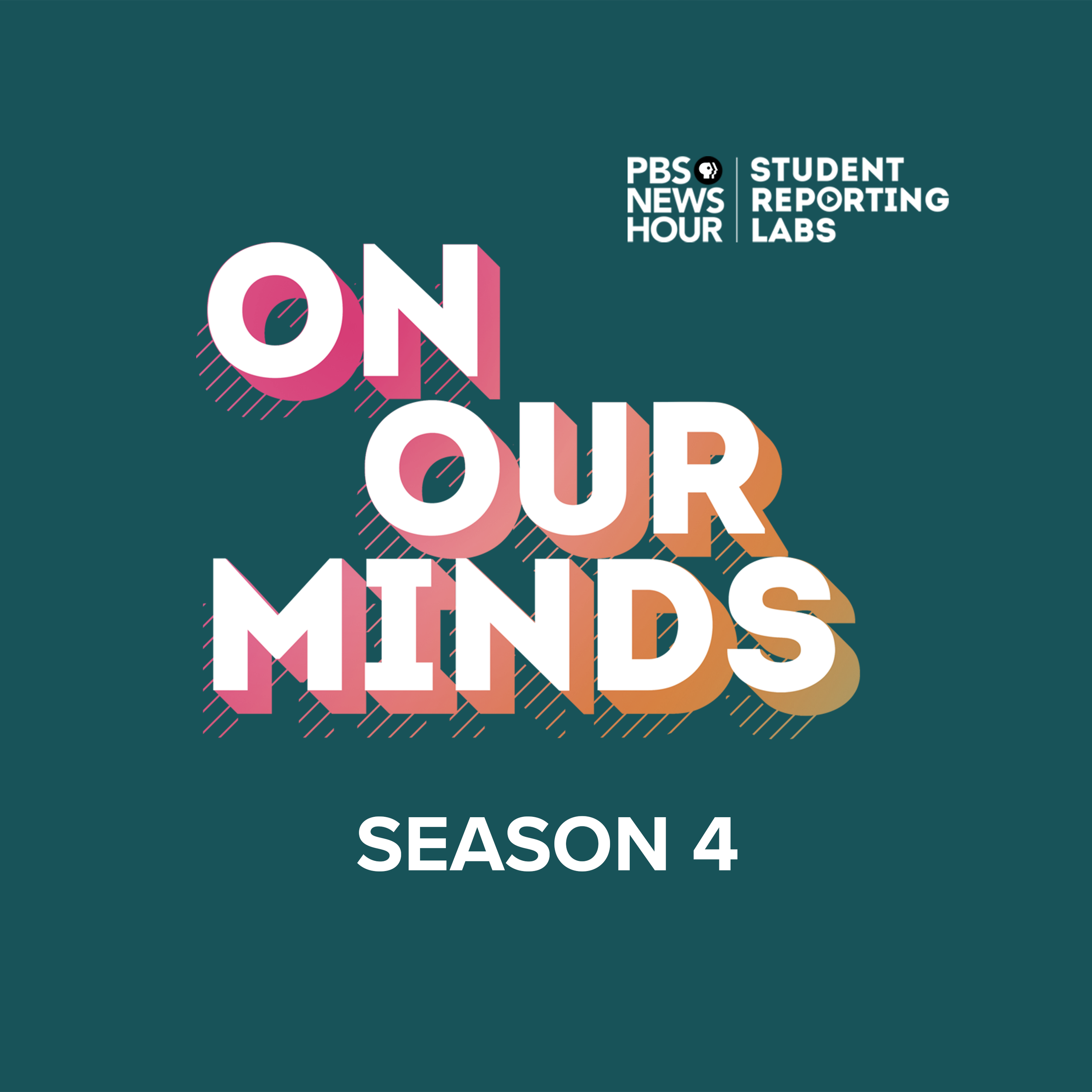
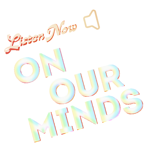
Event poster based on the road trip theme for the latest season of the On Our Minds Podcast.
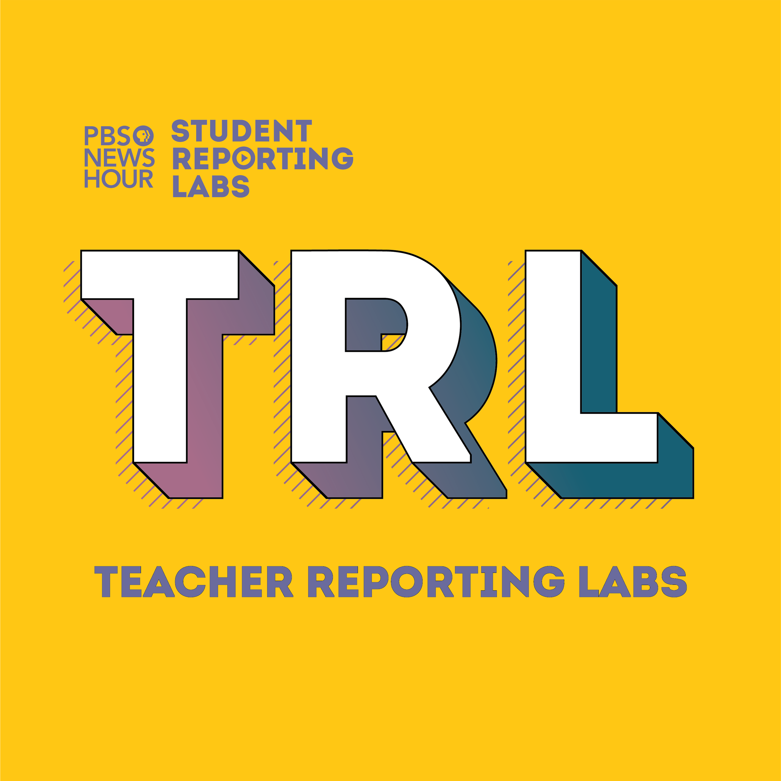
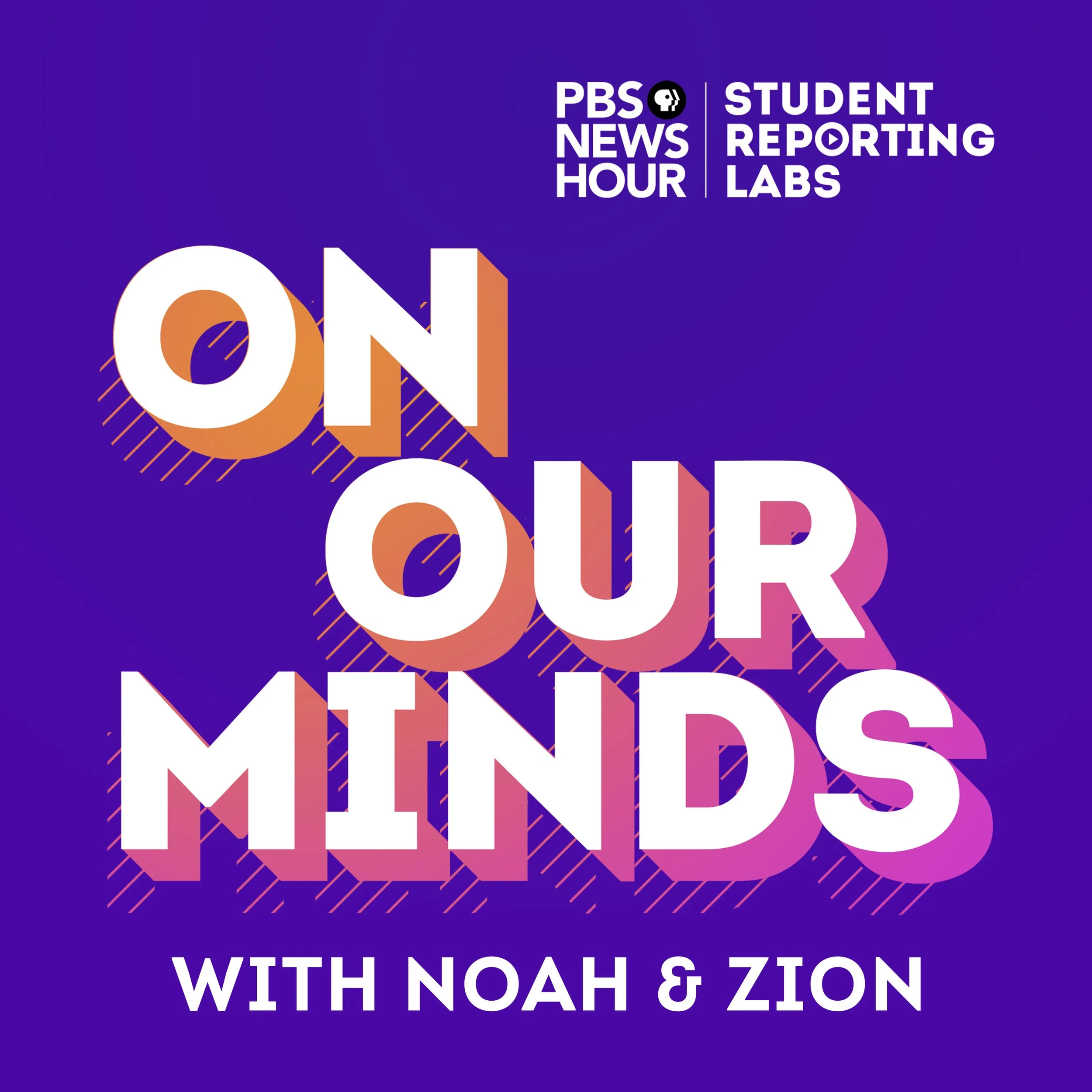
Podcast art and related posts for SRL podcasts On Our Minds and Teacher Reporting Labs. I used big text and/or strong colors to be eye-catching and easy to recognize in when viewed in a list or in a gallery.
Run Hide Fight: Growing up Under The Gun was another series that was student filmed and produced. In this series, I worked with the subjects to recreate their experiences with gun violence.
To recreate events from the past, I had to use stock footage, and play with frame rates, overlays, delays, and other effects to show their harrowing experiences.
It has been screened at festivals like SXSW EDU Film, the Oakland International Film Festival, it was broadcast on 34 local TV stations, and since been viewed at many community and school screenings.
One of the big projects each year is the Annual Community Report. It’s usually a 25-30 page document that I design. Summarizing the year in a way that’s easy to digest.
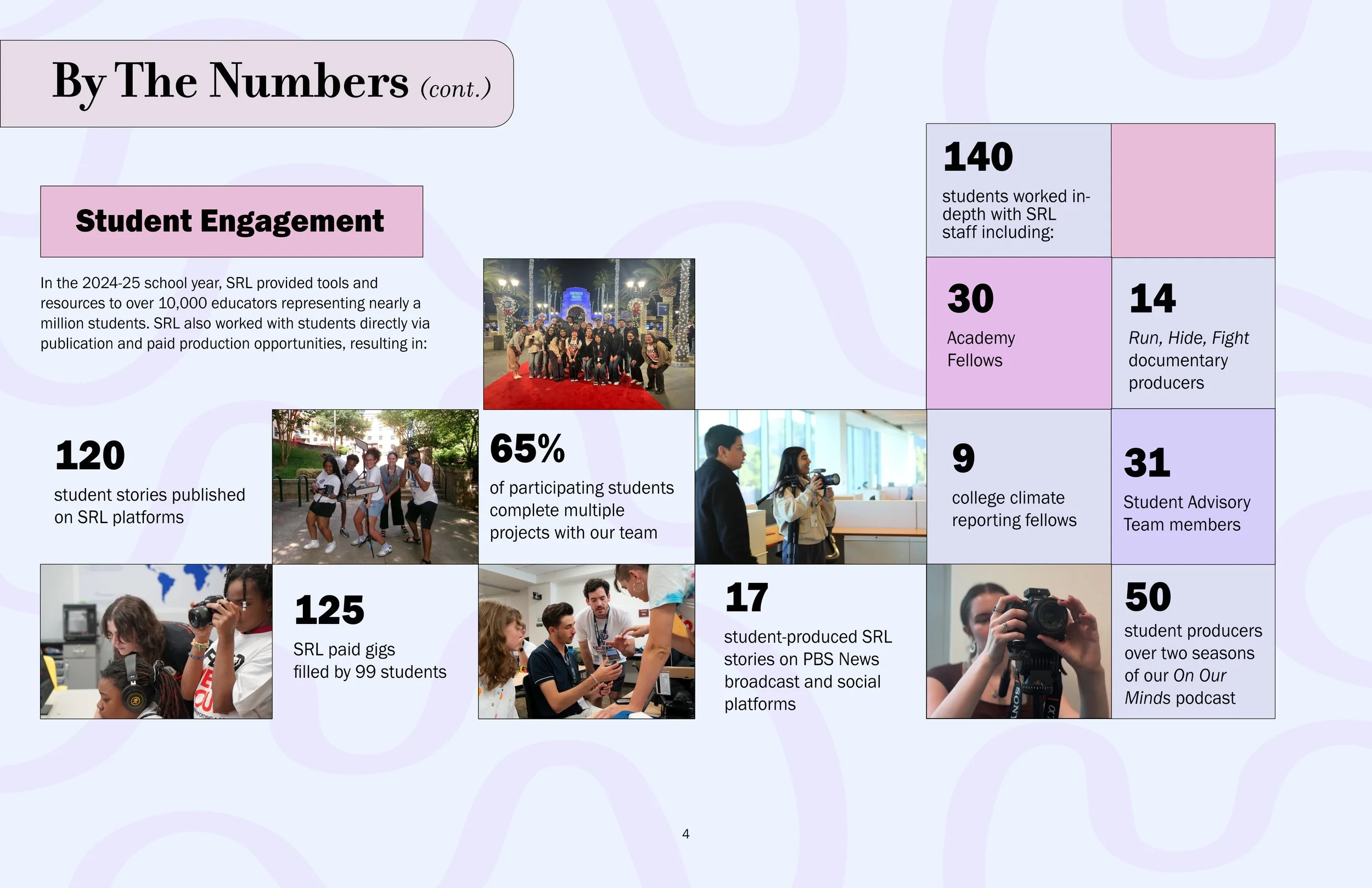
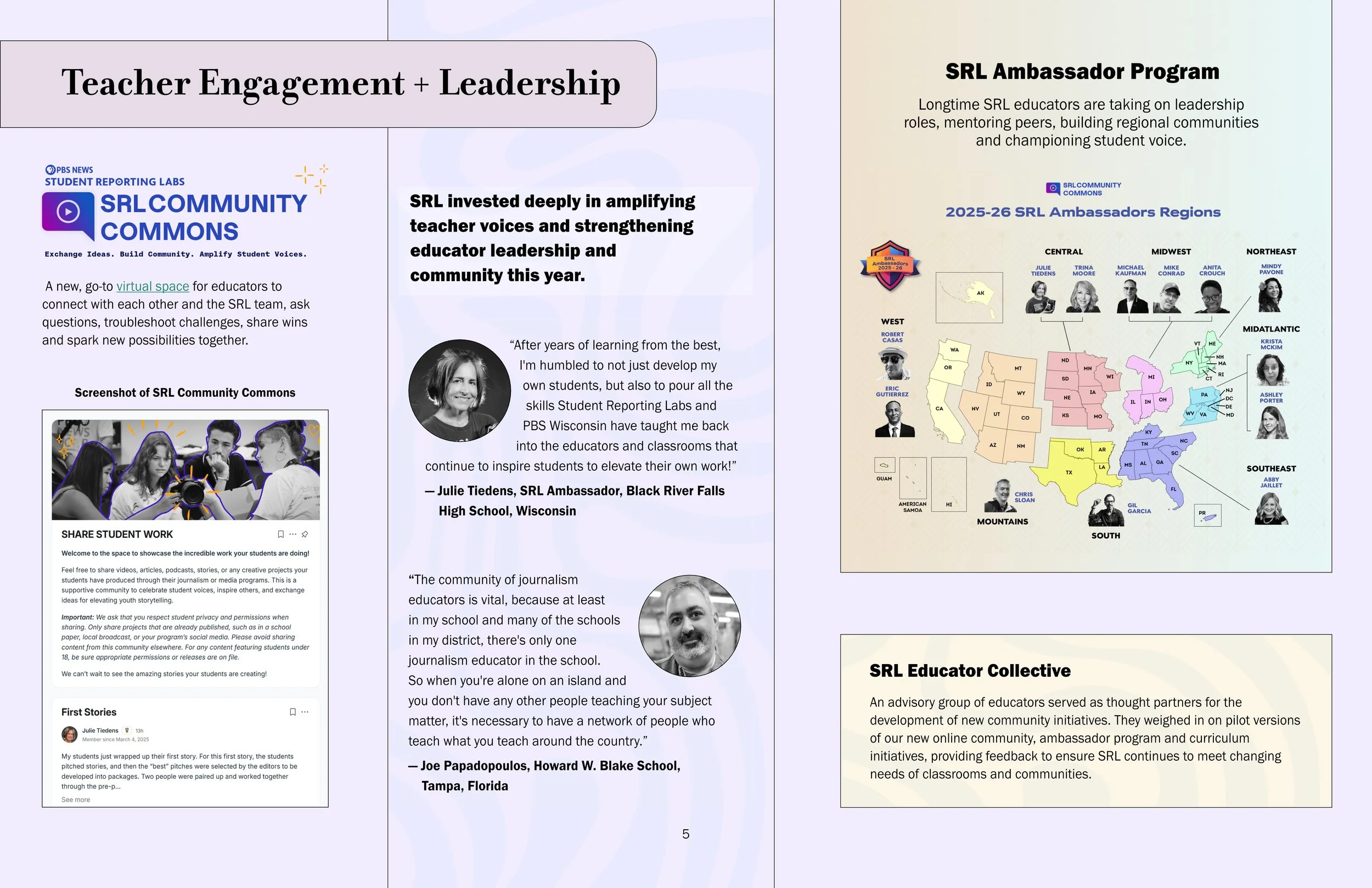
I used to use InDesign to make book layouts but eventually switched to Affinity Publisher for it’s simplicity and speed. I made the map using QGIS and Illustrator.
designing the intro animations and other graphics for the shows, I would run design workshops with the producers, and consult the students to come up with the look and feel.
I’m always interested in finding ways to use design to keep our audience engaged. I made these stickers and got SRL verified on Giphy so that these can be found on Instagram, TikTok etc. I made these using Spline and After Effects.

THE CONVERSATION
At my previous job at The Conversation, I was the multimedia editor. I spoke to scholars and made videos explaining their research, often using just motion graphics, remote interviews, stock and found footage. I made about 10 videos a month in this way.
I made a lot of transitions and type animation, a lot of charts, a lot of maps, and a lot of Ken Burns effects.
One of my favorite sequences that I made is this one here showing why cell phones are called cell phones.
Another one that I’m proud of is this video about the historical function of fashion as a tool for social distancing.
I also interviewed scholars and published those as Q&A articles. When needed, I made illustrations and gifs that helped viewers understand the story better. All the work was republished by publications around the world under a Creative Commons License.
Some of the articles include-
What you need to know about the new COVID-19 variantsAn infectious disease expert explains the results from Moderna’s latest vaccine trialsRats help clear minefields in Cambodia – and suspicion of the militaryHere’s how to stay safe while buying groceries amid the coronavirus pandemicHow pandemics have changed American cities – often for the better
LEDE PROGRAM
In the summer of 2025, I took part in the LEDE program at the Columbia Journalism School, where I learned how to use gather process and present data, make all kinds of static and interactive maps, and tell stories using interactive tools.
I made these maps trying to copy the style of The New York Times.
This map shows the area controlled by the Roman Empire at its peak.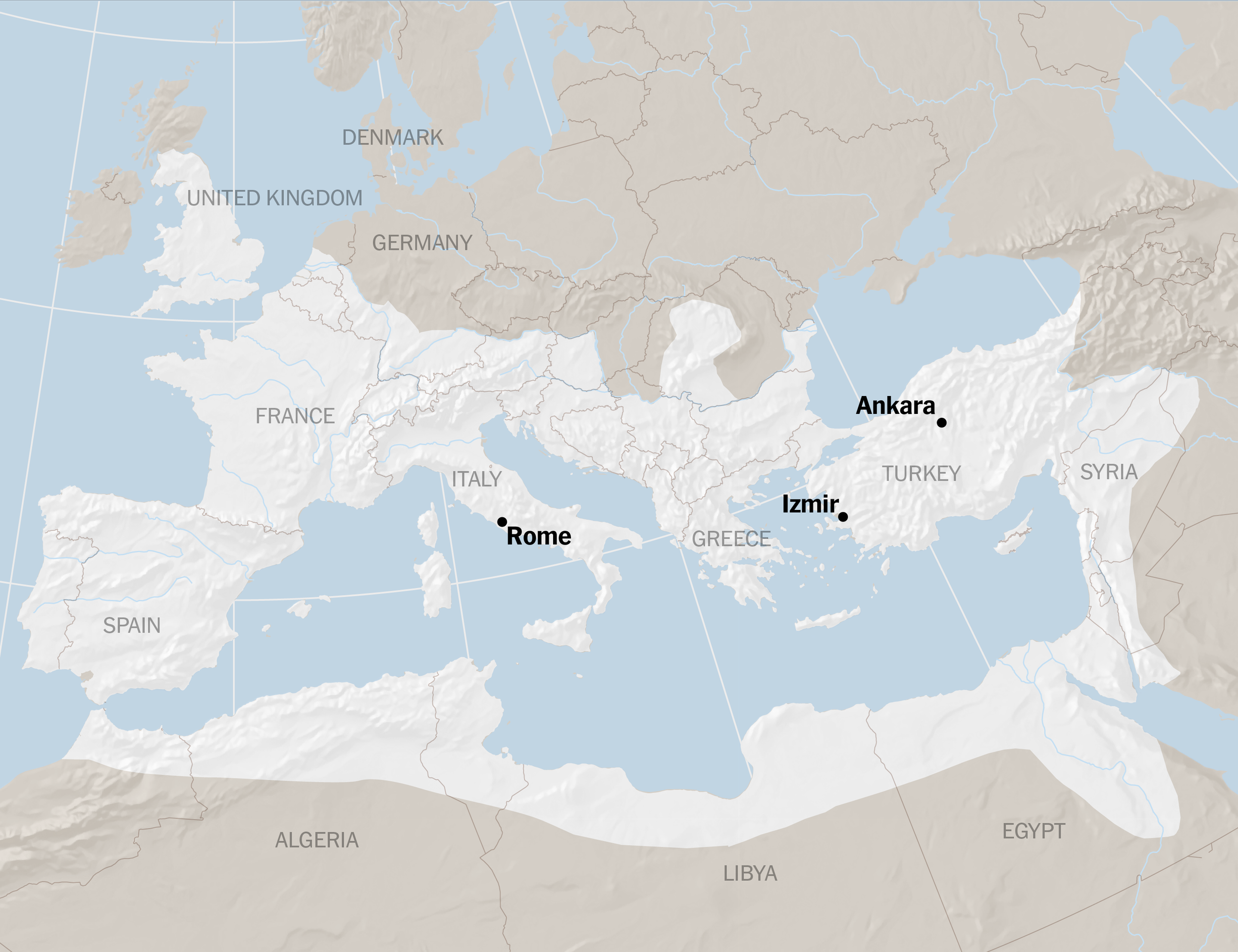
This map shows how much areas in Ukraine were bombed by Russia.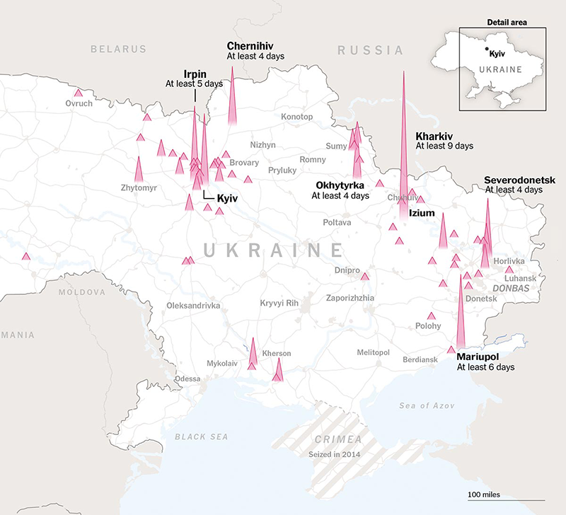
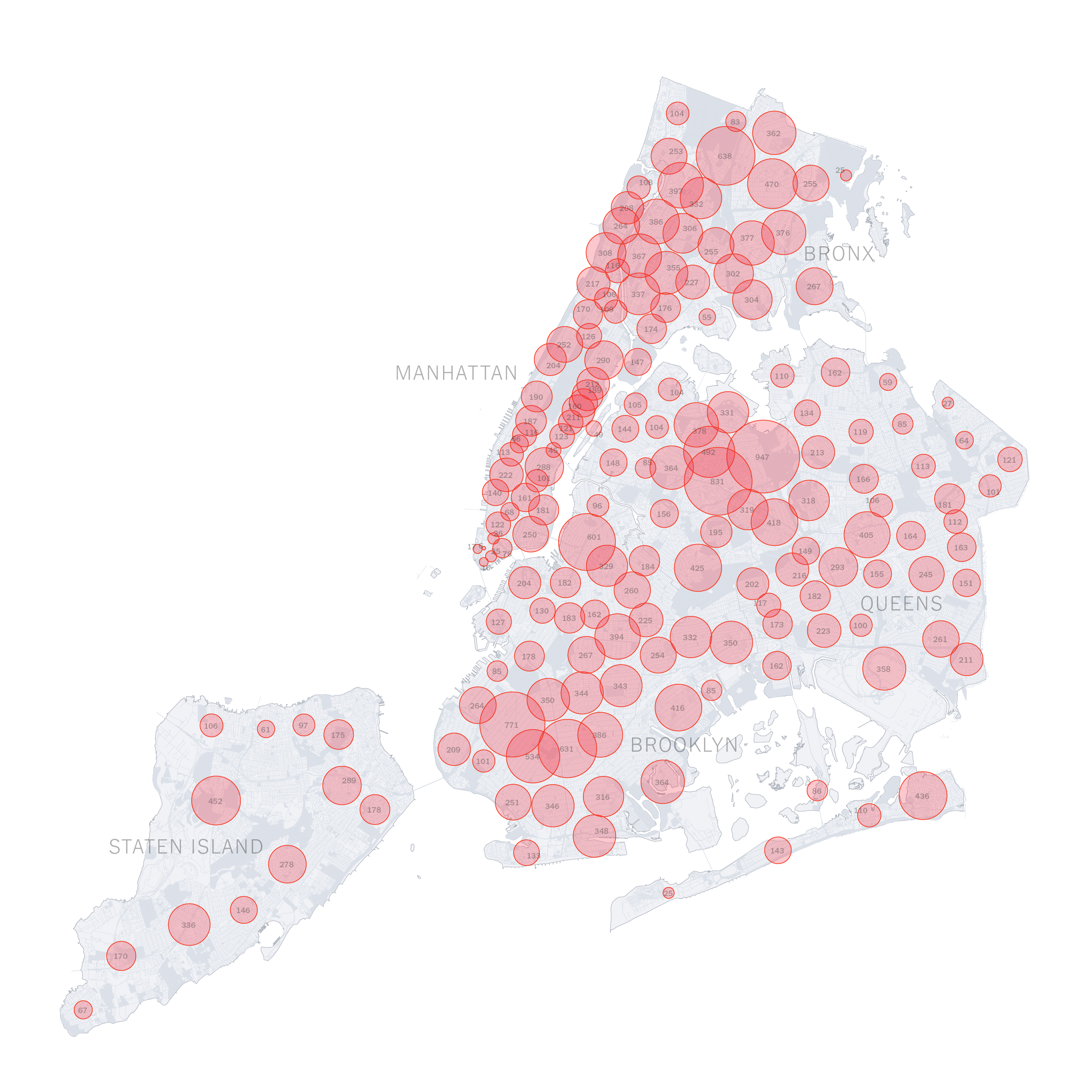
This map shows clusters of NYC COVID19 cases.For my main projects I made a series of bike related interactive sites that involved mapping.
The first site was about identifying the most dangerous places to bike in Brooklyn. I processed NYPD crash data and mapped it onto a map of Brooklyn using GeoPandas, QGIS, Illustrator and Photoshop. The article also talks about issues with bike safety and the City’s efforts to address them. To show this I also mapped all traffic calming measures installed on Brooklyn’s streets. Finally I processed the data to find the 5 most dangerous intersections and showed videos of me biking through the so the viewers can experience them. The site was made using Scrollama.
The second site was more of a personal project, and had two parts. The first part shown here below was about my bike tour across Korea. It shows how the trip came about, how I packed my bike and luggage, how I planned the route etc. I used Javascript to create the interactive elements. Everything else was done using Photoshop and Illustrator. Part of the reason for doing this was that I initially planned a book, but I felt like I would end up with a very large book, because I wanted to be very detailed with the info, so I turned it into a website instead.
The second part of the site is the journey tab, which has my thoughts on each day’s journey, and a map that shows my journey as you scroll down. This was made by making the original map animation in After Effects, and using a Javascript library called Scrollyvideo.js. to control the playback via scrolling. After making this site, I realized that ideally I would need to have done this using a completely different process such as using apps like Rive.
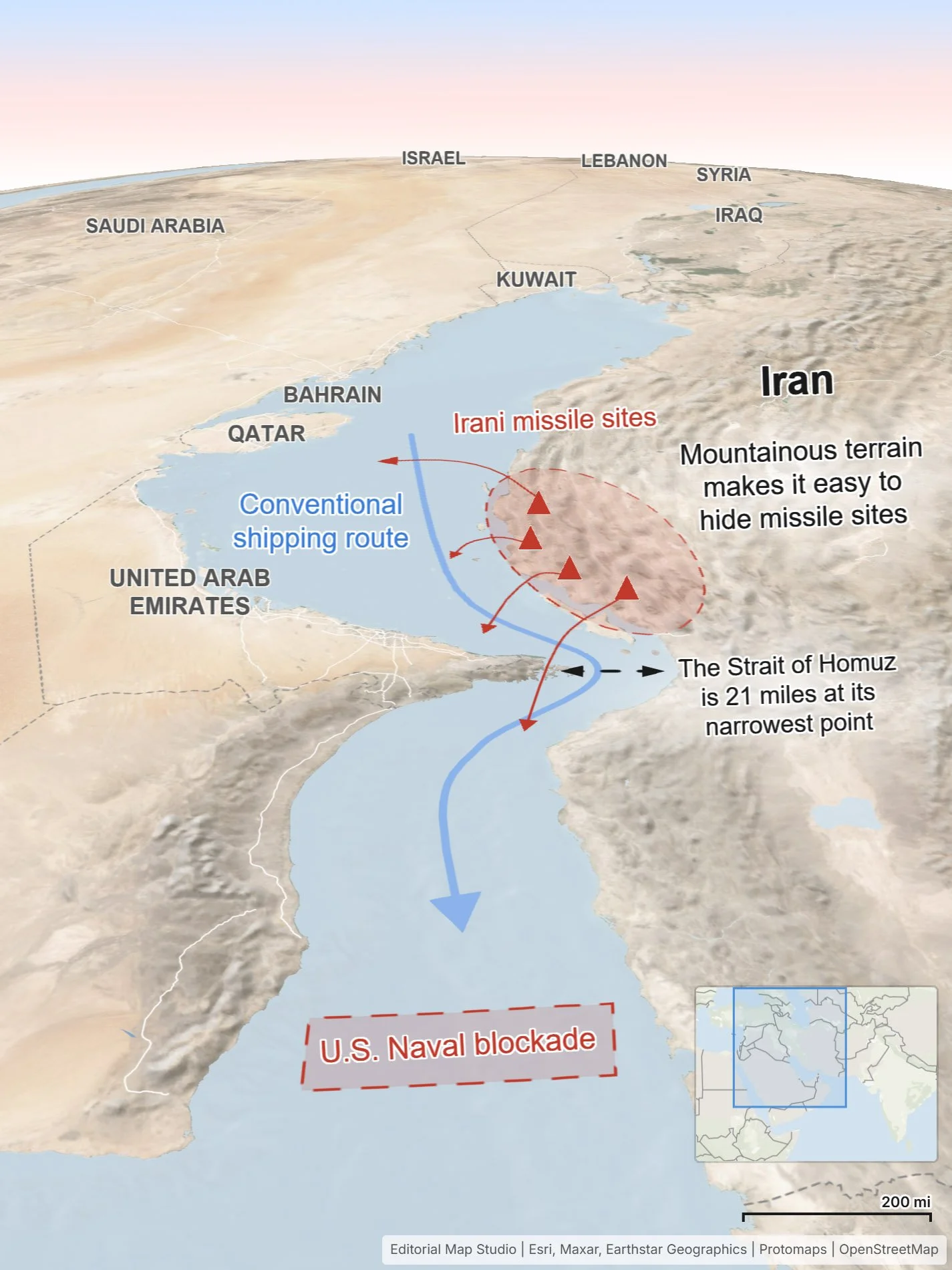
EXPLAINERS & MAPS
I would love to make more videos that involve explaining and teaching new things about the world. Here are some examples of videos and map animation made using After Effects, Photoshop, Illustrator, QGIS and Geo Layers. I’ve combined these videos into a single package here.
A short vertical video about my bike trip across Korea.
A map animation about the Medog Hydro Power Project in China.
A map animation showing the Strait of Malacca.
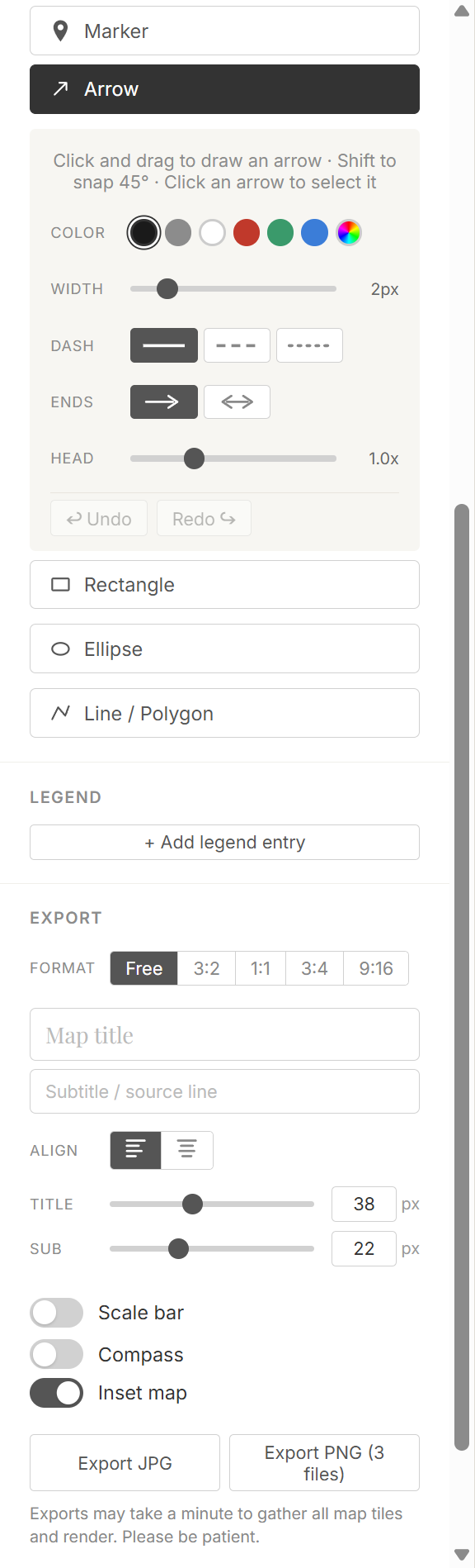
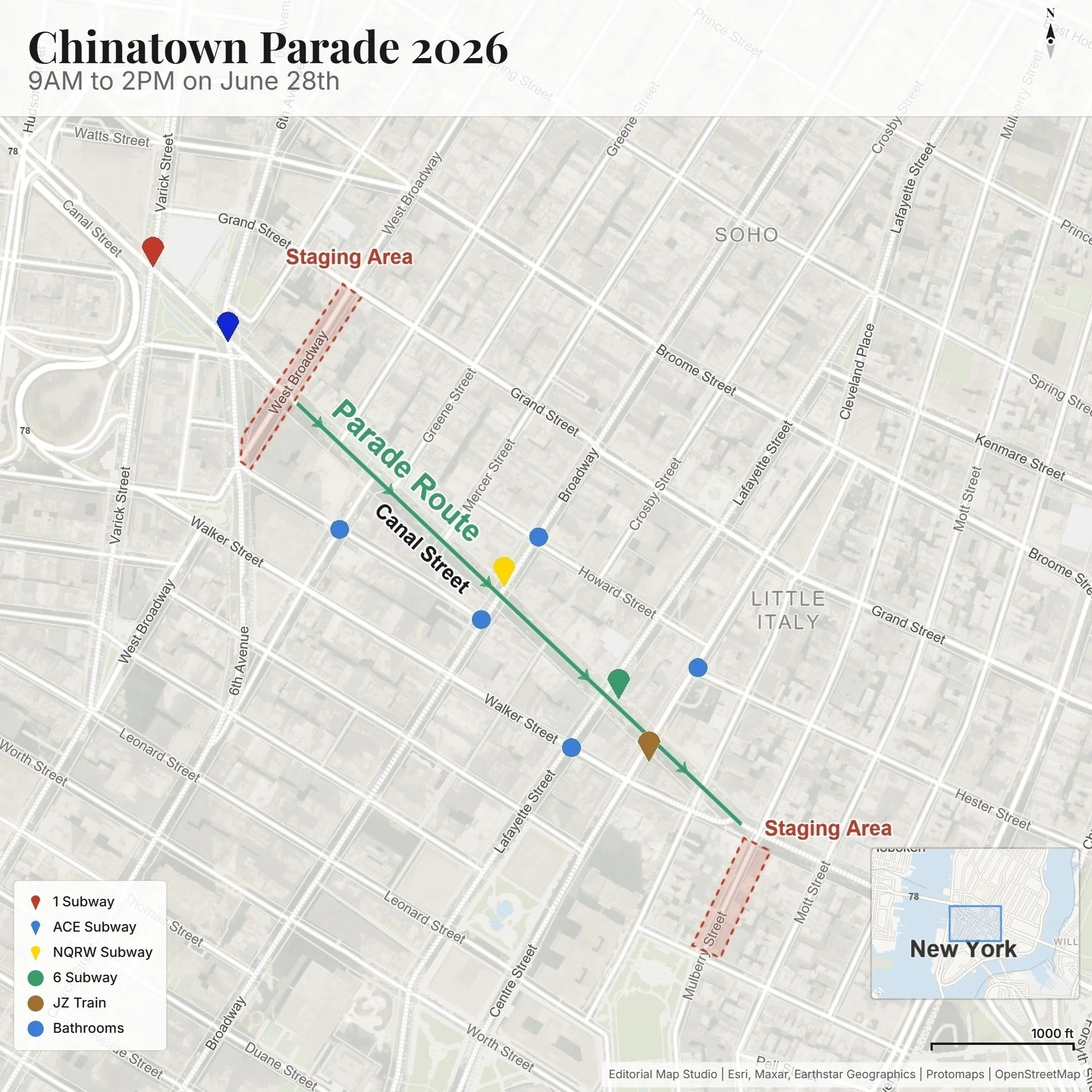
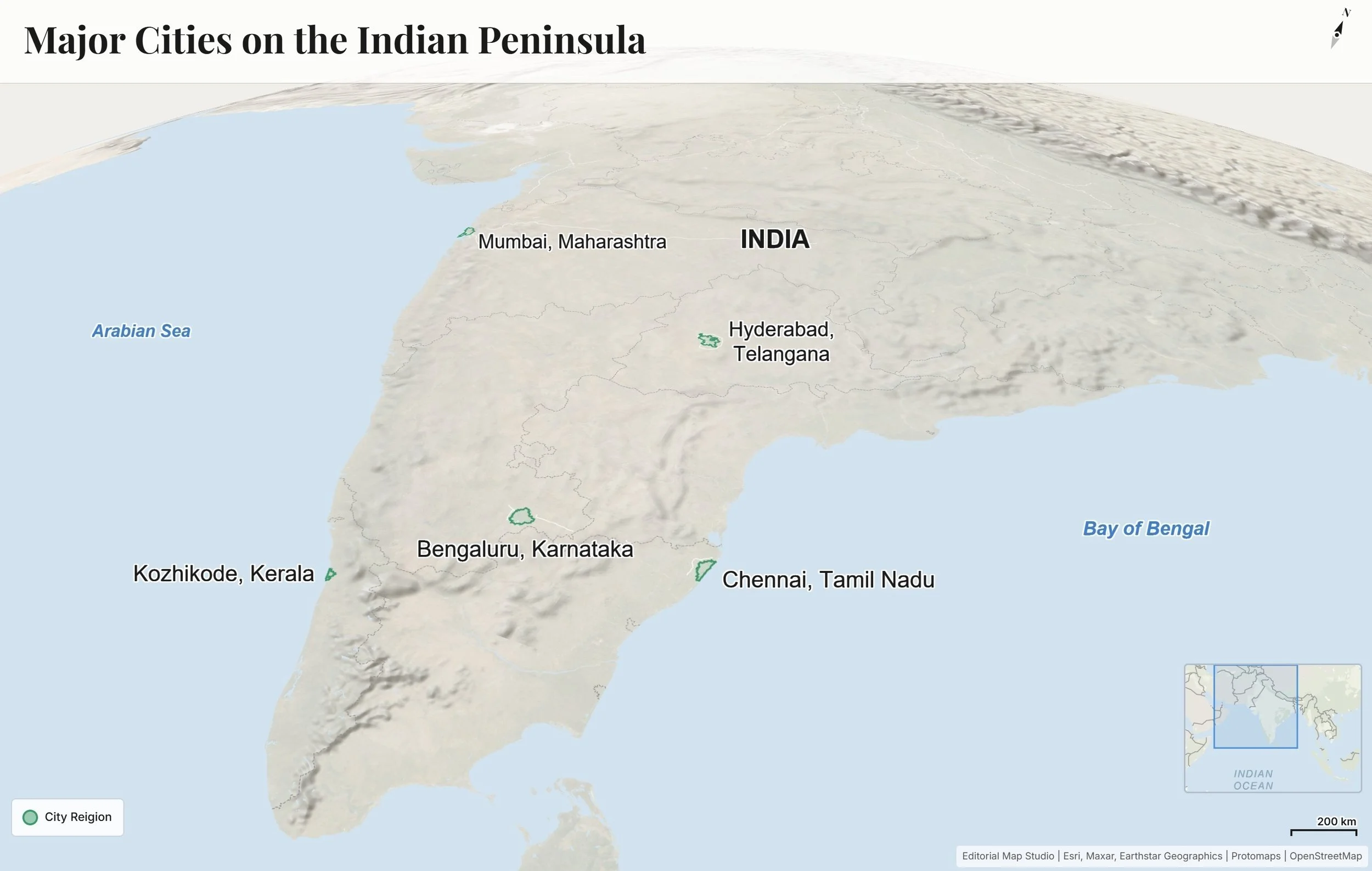
A Tool For Simple Maps
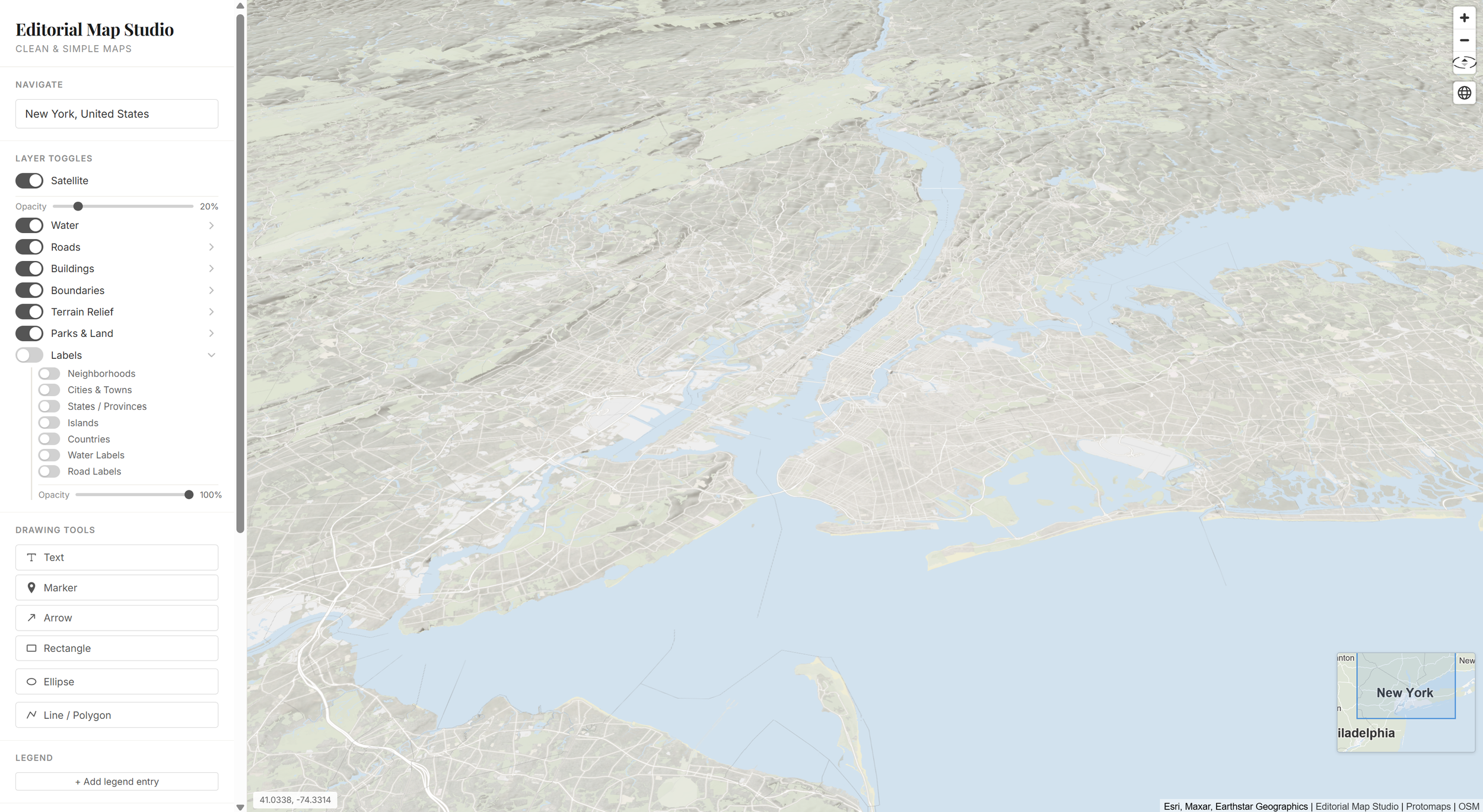
I found that making simple maps is way harder than it should be. So I made this tool, called Editorial Map Studio, to create clean, simple and highly customizable maps for free. What would take an hour or more now takes 5-10 minutes.
One way I feel like I can leverage AI is by making tools that make things that are hard to do easy.
GitHub Link to the project
Features include-
Search with Open Street Maps
Draw outlines, shapes, arrows
Customize their strokes and fills, add dashes, arrowheads, etc.
Add legend, inset map, scale bar, title, compass
Change aspect ratio of map for export
Download a .jpg or .png with base map, drawn features, legend etc. as separate layers.
Draw shapes on the map and export as .geojson or .svg
Paste CSV data to place points or value bubbles on a map. Includes auto-geocoding, label placement options, etc.